
a travel magazine for today’s traveller
 icd studio / 9 December 2020 / inside stories
 Outlook Traveller, a well known monthly magazine based in India, focuses and dominates a more accessible, popular and economical space in travel; an alternative to its exclusive and luxurious counterparts.
They reached out to us facing declining sales and readership. The reasons for which are many, but the biggest being the general shift in the public’s dependency on print for any travel information, to the internet with its seemingly unlimited database on the subject.

The changing industry
The internet has disrupted the travel industry—hotels, airlines, tour operators, which controlled knowledge and perspectives on all things travel. Shaping what’s popular, niche or unexplored in terms of destinations and experiences. The Industry is now waking up to the fact that travellers are doing their own thing. Publishing information and opinion about their own experiences and places they have discovered. Coupled with the fact that nothing is more convincing than a fellow traveller’s recommendations, the industry faces an uphill battle.
Speaking to today’s traveller
The travel magazine needs to carve a unique and invaluable space for itself to remain relevant for travellers today. The 21st-century traveller is more exposed to the world and has already experienced more than its previous generation. They now yearn for more than the beaten path. They want to plan or rather, un-plan their journey—an exploratory spirit of travel rather than a planned tour. Destinations are not just about the spots of scenic beauty but about the people you meet, the strange alleys you walk through, the memories you make, becoming a local in an unfamiliar place. The new magazine needed to suggest spontaneity. A sense of being locally aware of all the places it talks about, encouraging the traveller to discover more. It must play an inspiring role in a traveller’s life by bring- ing out more dimensions to destinations—enabling them to experience places by their local food, art, culture and people.
Finding the Traveller voice
Suitcase vs. Backpack, Oxfords vs. Sneakers
We identified aspects of the existing voice of Outlook Traveller and the kind of voice we wanted the redesign to have. Outlook Traveller prides itself on travel writing, the pages read with an air of someone knowledgeable talking at the audience. The visual scheme of the magazine jumped between long walls of text interrupted by large stock pictures. This format inspired literary reading, not an invitation to go visit a place.

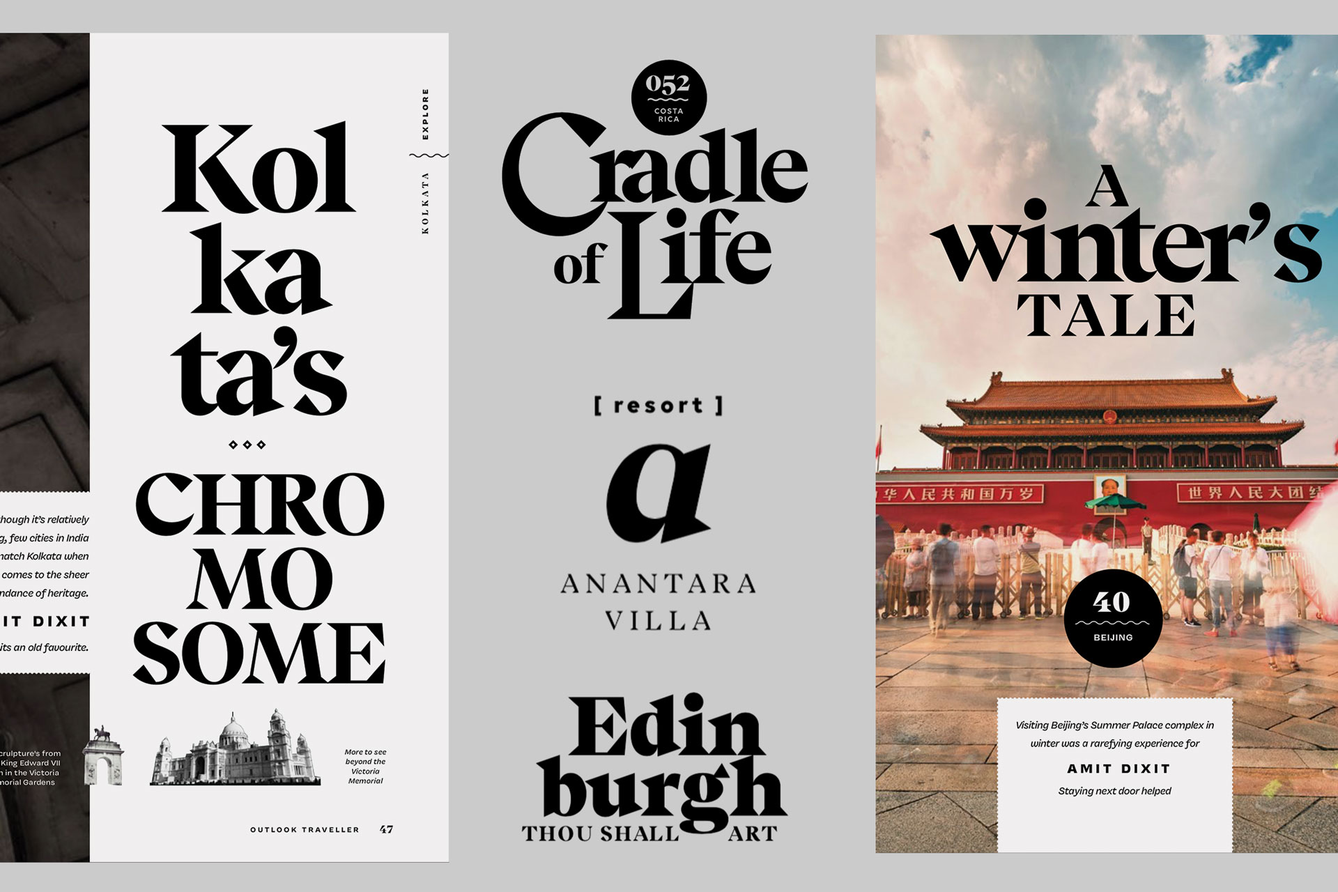
The choice of type
Typefaces are the most identifying feature of a magazine. We, therefore, decided to choose a combination of two typefaces with strong characters that can coexist and take on different roles.
Beirut took on the expressive role of large headlines and led all feature stories. Calligraphic in structure, with bold shapes and contrast, its distinct voice has authority but also appears quirky and contemporary. The lighter weights also add a literary character to the magazine.
Vulf sans played the functional role, demarcating the structure of the magazine. It was used to mark sections, it’s quirk in character becomes apparent in large sizes. Vulf also created a format for displaying concise information in the newly introduced devices, and for small sizes and lists.
These two contrasting personalities come together to create a mix of functional and expressive. Connecting the two typefaces with a common soul.
Headlines as a characteristic feature
We took a new shot at some existing stories by Outlook Traveller. We started with the titles of these stories and played with the typographic style and arrangement to see the breadth of expressions that a single typeface can accomplish across the magazine. Squeezing out all the juice that a given typeface lends itself to. The range of things you do with the right choice of type adds up to become a defining characteristic of the new Traveller.
Illustrations
Hand-drawn illustrations add texture and colour to the page and help bring the place alive. We explored various styles and the degree to which they could be incorporated into stories. Clumsy and imperfect drawings accompany various kinds of information throughout the magazine in selective places—they only appear with useful information, and are not to be used as decoration.

Cover
A change in the choice of images in the cover was key to express the shift in tone. Continuing on the line of our theme, we decided to go with spontaneous, casual scenes one would stumble upon themselves. Experience the destination rather than see it on a postcard.
Show people—as the subject or as background, close-up, far away, single, or in groups.
Human perspectives—streets, buildings, landscapes from vantage points. Scenes that can be seen from the human eye. The redesigned cover format is denser with several titles and includes phrases that introduce articles. These articles can be played around typographically.

Masthead
The new masthead stenciled on Beirut Display calls back to an earlier, charmed world. Adding a hint of authority and confidence to the name. The letters play with almost-ligatures that a typographer would itch to perfect, much like many odd hand-painted signage one spots while exploring new places. The eccentric characters and circles in the unit hint at the typographic style that’s to come in the feature stores, celebrating the unpredictability and happenstance of travel.
Thinking about the readers’ flow
Creating pauses
As we dug deeper into the stories, the work did not just rest on image and type but also needed editorial interventions. The magazine had travel insights buried in running text, pushing writers to fill pages with paragraphs of flowery writing. We want to appeal to the readers’ natural tendency to flip through pages until something of interest stops them like pictures or titles or signposts of various kinds that catch your eye. We needed to increase the glanceability of the pages and maintain a visual rhythm across sections.

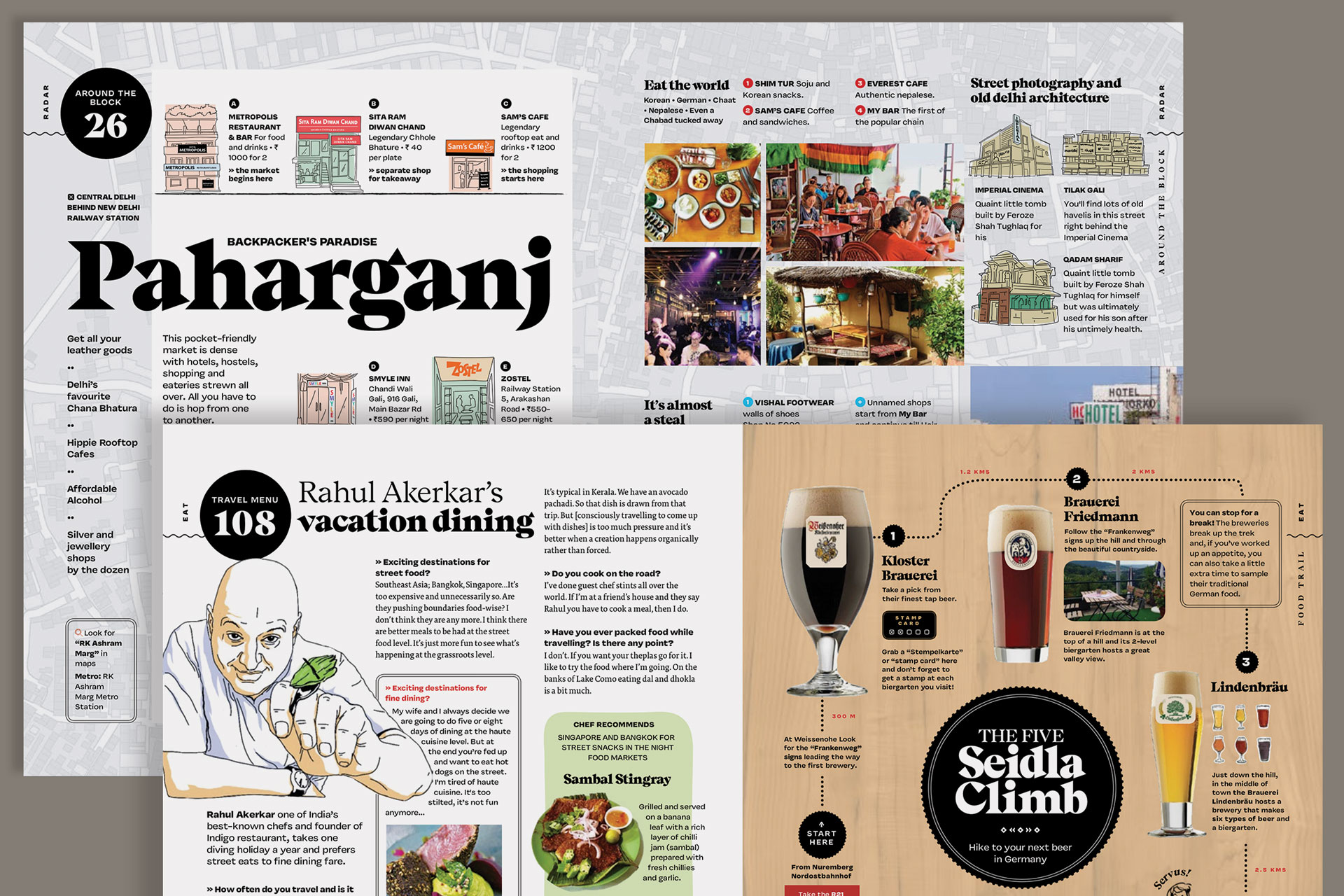
Sectioning
The redesign also saw a new format for sections. The existing issue was divided into sections: Front, NSEW, Hotels, Cover and Feature stories, Back of the book. It was their editorial decision to go with sections that are more relevant to the reader and made more sense to him/her.
The new sections were organised, with names that are easy to understand and direct:
- Front: About the team, issue, reader engagement
- Radar: Short regular features and travel updates
- Explore: In-depth feature articles
- Stay: The dedicated hotels’ section
- Eat: Short features on food travel
- Back: Light reading on books, interviews, product recommendations
Each section opening also reflects the kind of editorial pieces it contains. Radar, Stay, Eat start with a short feature, opening to sections which have shorter articles. Short articles are limited to 1 page (2 in some cases) while Explore houses feature articles going from 4 to 12 pages. The book becomes less cluttered along the middle of the book, both editorially and visually. Signalling to the reader a change of pace from short reads to longer ones.

Being useful to the traveller
Mix bag of highlight & pullout devices
We highlighted information from stories in devices that over time become familiar signposts. Extracting local knowledge, fun facts, drawings along with the standard pull quote to bring them a level above body text. Adding flavours of a travel journal into an editorial format.
These fixed sets of devices sprinkled across the magazine give an impression of variety. An oddball mix of bevelled corners, double strokes, squiggly lines all in black hint at old travel signages and postcards.
- Protip: local practical knowledge that a reader can act upon, this may also be used for interview
- Fun Fact: trivia about the place that’s additional to the article, not related to the narrative going on
- Softbox: Separate information related to the article, must always have a drawing or image
- Explore Pitch: This treatment also extended to how we introduced any new story and section. Pitching the story in key phrases so you know what you’re getting into.
The infobox
The infobox usually appeared at the end of select feature articles. It summarised useful information about the destination covered in the article under 3 neat headers: how to get there, where to stay and things to do. The clients themselves saw an opportunity to elevate the infobox and asked us to redesign it to make it more illustrative, rich and stimulating for the reader to make a stop at.
We took apart the infobox along with the articles it was part of. The infobox essentially takes the same facts and tips from the article and reorganises it into an itinerary for the destination. We saw an opportunity to turn the infobox into a complete rough guide to experience a place. By extracting tips and anecdotes from the article we broke up the given information into a pleasing mix of pictures, text and line drawings. As a result, this exploded infobox takes on the character of the story and the destination covered. The box is also branded with a symbol created for each destination for readers to recognise it as a signature traveller content.

Unique to the story
The grouping of all information under—how to get there, places to stay, things to do seemed repetitive for all articles. We quickly realised that the new Infobox could answer the same questions but also forefront the unique attractive propositions that each destination offers by having them in the headings and sub-headings itself. This made the Infobox unique to each story.
Flexible in size
Due to the nature of the process of releasing a monthly issue, this segment also needed to be flexible in its length, it could occupy from 3/4th of an entire spread to 2 columns on a single page and still retain its exciting character.
The travel journal spirit
Treatments like cutouts, bulleted & checkbox lists, sketches and illustrations in a limited palette add a personal quality to the Infobox giving the impression of a traveller’s journal. The new Infobox is deliberately less ordered in its layout, reflecting the nature of a traveller exploring a place.
Implementation
Guidelines rather than Rules
At the end of this 6-week long process, we had created a single redesigned issue. This issue had been designed to not be followed like a set of regulations. Doing so would cause it to become repetitive issue after issue. Variations from one issue to the other was something that was desirable; and possible if it’s absorbed as a set of principles that define the overall ambience of the magazine. It affected not just the design of the page but also how the story would be written.
To facilitate this, two members from Traveller’s team (a designer and a writer) went through redesigning the next issue, with us playing a guiding role in the process. We encouraged them to expand on the ideas from our redesigned issue and find fresh ways to make pages using the same components and principles. They eventually, in turn, would infect and train the rest of their team, allowing the traveller’s new avatar to have a continued lifespan.
